Project: TPB Rebranding
Agency: Rainger & Rolfe
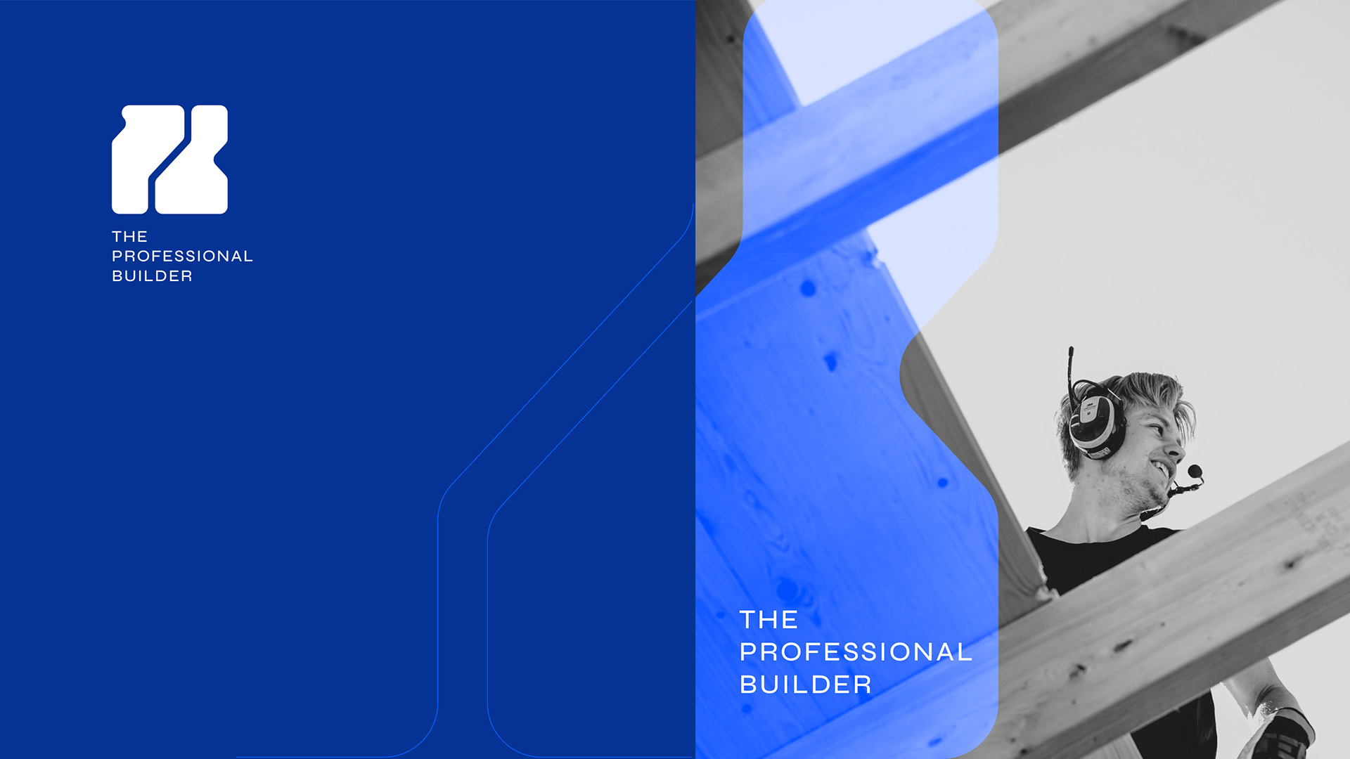
Client: The Professional Builder
CD: Kelly Putter
Art Direction / Graphic Design: Jaime Calla
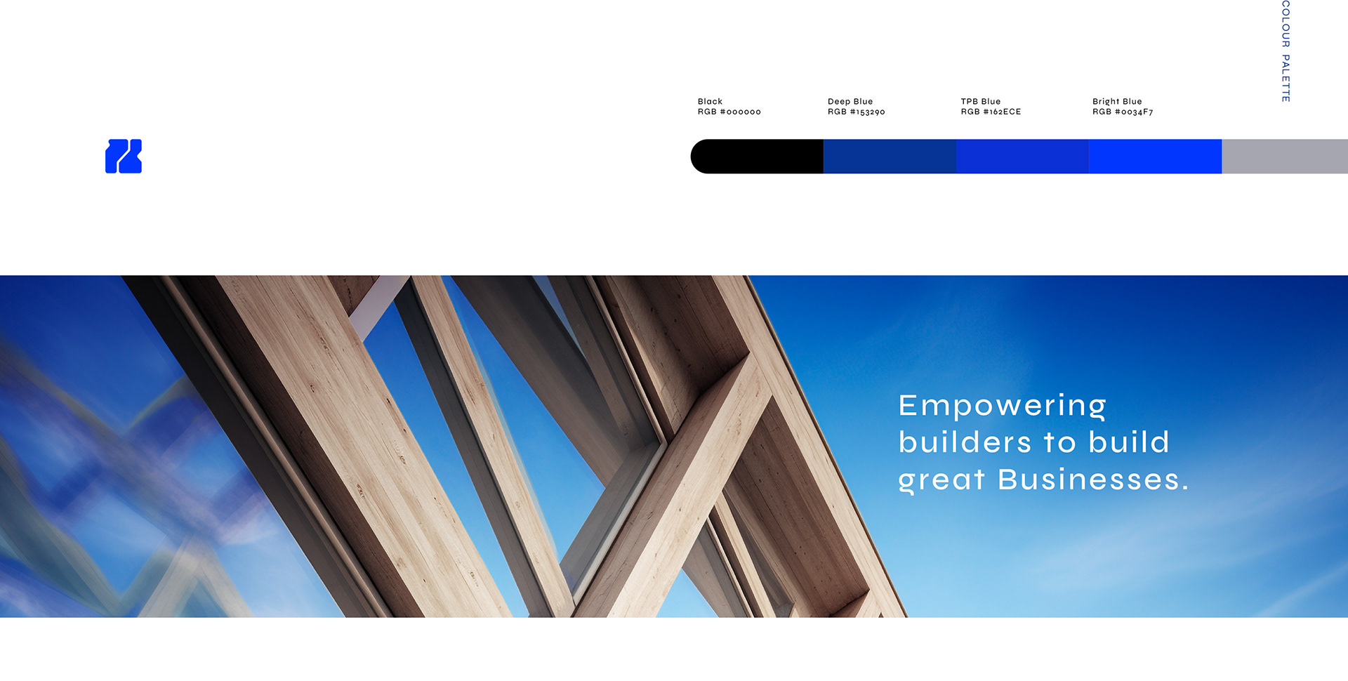
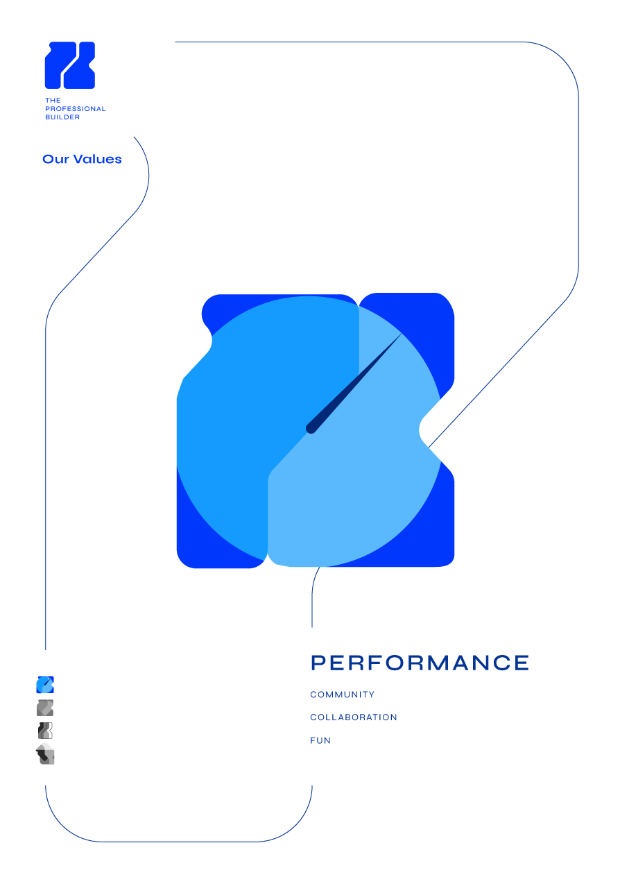
This rebrand strengthens The Professional Builder’s identity through a cohesive visual system that communicates professionalism, reliability and modernity.
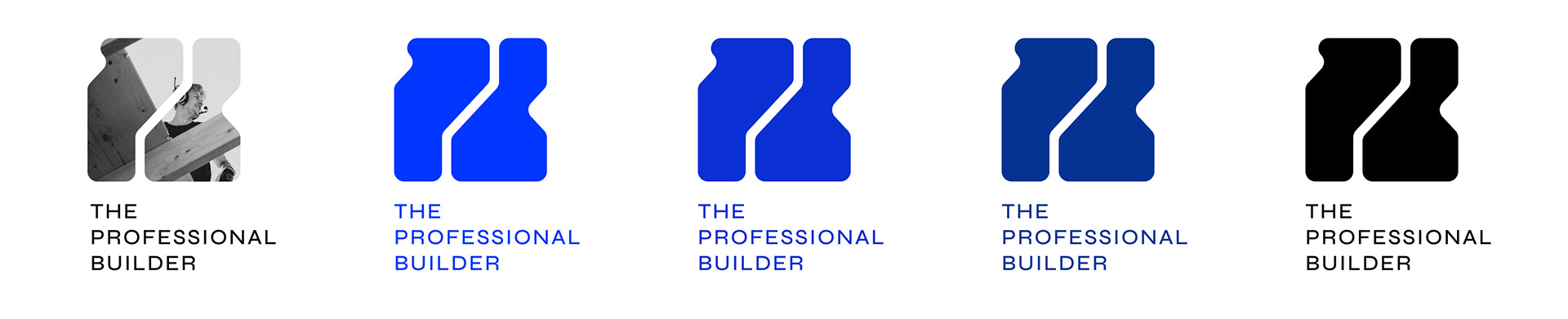
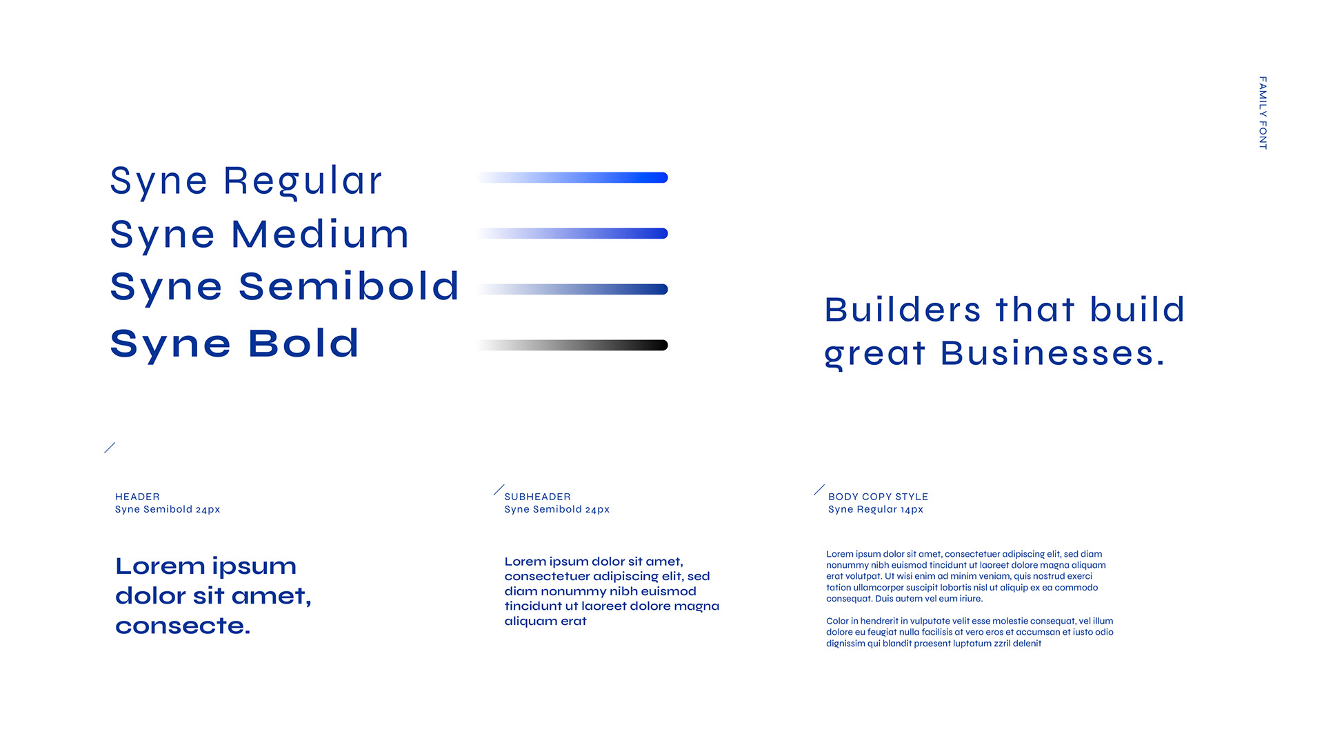
The logotype is clean and contemporary, using a refined sans serif typeface that performs consistently across digital and print applications, giving the brand clarity and lasting impact.
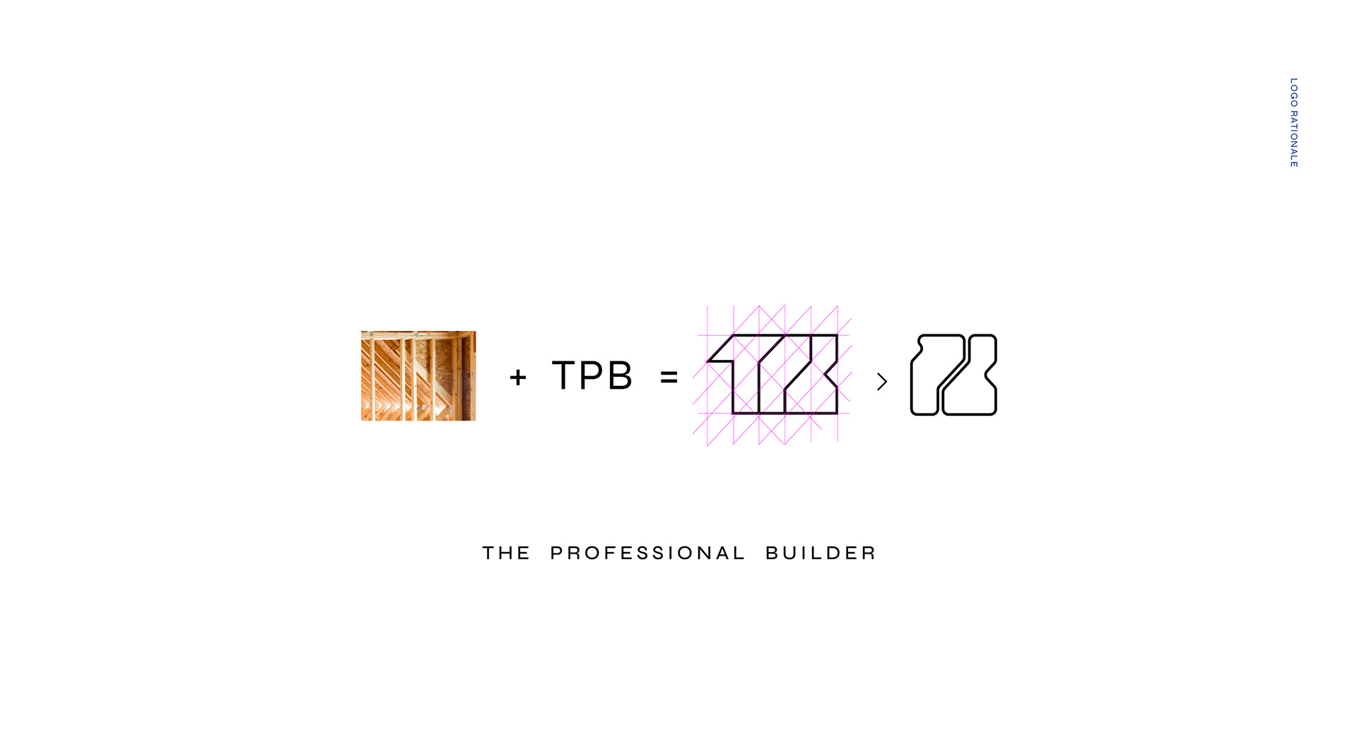
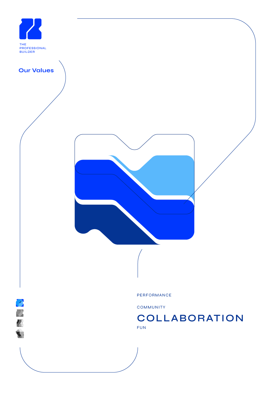
A distinctive monogram, inspired by construction layouts, simplifies the TPB acronym into a bold, memorable PB mark, reflecting the company’s expertise and precision. Together, these elements form a confident, unified identity that reinforces core values and positions The Professional Builder as a leader in its sector.